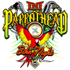
 VECTOR COLOR SEPARATION
Colour separation is a crutial step in making a vectorized logo. To make it simple, to produce colour images or artwork the print machines separate the image into four plates. Cyan, magenta, yellow, and black. The combination of these fours results in a high-quality image that we wish to have.
KEEP A BALANCE
You need to keep a balance in your logo design to make it look appealing and eye-catching. You need weight, graphics, colours, equal and symmetrical.
PLAY WITH THE COLOURS
You have to know the art of using colours. Play with mixing the colours and use the right combination to make a unique logo. However, don’t be sceptical. The colour combination of your vector artwork or logo should be simple yet elegant.
USE SOFTWARE THAT YOU ARE COMFORTABLE WITH
Always use vector software that you are comfortable with. There is numerous vector software like Inkscape, Adobe Illustrator, Corel Draw, Karbon, and much more. It all depends on your choice when choosing the software.
USE SOFTWARE THAT YOU ARE COMFORTABLE WITH
Balance your vector image with the appropriate use of stroke and fill. To get a high-quality image, you need to use the perfect combination of stroke and fill.
These are some of the main factors that come into consideration when we talk about vector colour separation. You can take our vector conversion service. Our prizes for this service is pocket-friendly.

